Scroll to explore
https://app.amzfreeil.com/
Roast Complete

“As someone who spends way too much time manually checking Amazon for shipping eligibility to Israel, this tool hits a massive pain point for me. It’s a simple, focused utility that solves a very specific, frustrating problem without unnecessary bloat. I appreciate the transparency about how it's funded, which makes me trust it more than a random free tool. I’d definitely use this to save time and avoid those annoying shipping cost surprises at checkout.”
Biggest friction: The lack of clear, immediate social proof or user testimonials on the landing page makes me slightly hesitant about the reliability of the alerts.
Best thing: The core value proposition is crystal clear: it automates a tedious, repetitive manual task that directly saves me money.
Idea Assessment
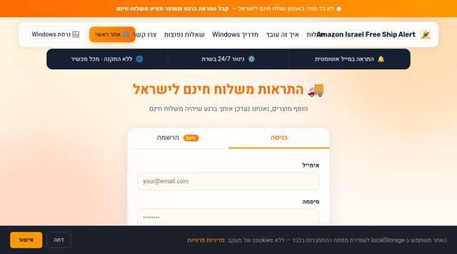
An automated monitoring service that alerts users when Amazon products become eligible for free shipping to Israel.
I'm curious about the latency of the alerts—how quickly do I get notified once the status changes?
Landing Page
Functional, straightforward, and gets straight to the point without marketing fluff.
Missing: Real user testimonials • A 'how it works' video demo • Clearer distinction between the web and Windows versions
Journey — 7 steps
“I like that it's direct. It tells me exactly what it does and offers a free, no-credit-card-required sign-up. It feels like a tool built by someone who actually needed it.”
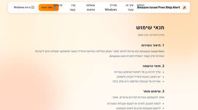
“It's standard legal boilerplate, but I appreciate that it explicitly states they don't sell user data. It feels professional enough for a bootstrapped project.”
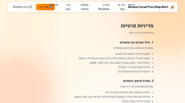
“Very transparent about what is collected and how it's used. Knowing they don't use tracking cookies is a big plus for me.”
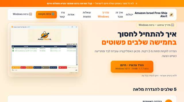
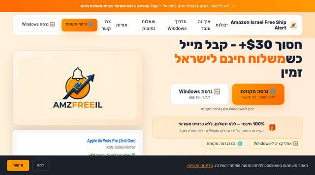
“The screenshots of the app interface are helpful. It looks like a straightforward, no-nonsense desktop utility, which fits my workflow.”
“I love the 'why' behind the tool. It confirms this was built by a developer who understands the specific pain of the Israeli Amazon shopper.”
“Reinforces the value proposition well. The 'save $30+' hook is very effective for someone like me who buys printers and other large items.”
Diagnosis
The conversion funnel is hindered by poor information architecture in the hero section, where the primary value proposition is obscured by secondary desktop software promotion. Users are forced to scroll past irrelevant content to find the core web-based CTA, creating unnecessary friction for the primary target audience.
What costs you conversions
What Works
Action Plan
Move the 'Sign Up' CTA button to the top-right of the hero section and center it below the headline.
CTA is located below the fold, requiring user to scroll.
CTA is visible immediately upon page load in the hero section.
Ensures the primary conversion path is accessible without scrolling.
Visually separate the 'Web Version' and 'Desktop Version' paths using distinct cards or buttons.
Mixed messaging between web-based tracking and Windows app download.
Two clear, distinct buttons: 'Start Web Tracking' and 'Download Desktop App'.
Reduces cognitive load and prevents users from being overwhelmed by irrelevant installation options.
Increase the CSS touch target size for all CTA buttons to a minimum of 44px x 44px.
Buttons have smaller touch targets, making them difficult to tap on mobile.
Buttons are at least 44px tall and wide with adequate padding.
Improves accessibility and usability for mobile users.
Add a dedicated 'User Success' section featuring short testimonials.
No section highlighting user experiences or social proof.
A section titled 'What our users say' containing 3 quotes from satisfied customers.
Builds trust and validates the solution for new visitors.
Add a 'Developer Profile' link in the footer.
No clear link to the developer's background or professional profile.
A footer link labeled 'About the Developer' linking to a professional profile.
Increases transparency and credibility for the service.
Quick Wins
Growth Potential
Based on b2c_saas benchmarks (Unbounce, Portent, Google)
potential revenue
$8,500/mo
Based on Keepa ($5M ARR)
currently realized
78%
$6,630/mo
uplift
-8%
more conversions
Given the niche geographic focus on Israel and the specific utility of shipping alerts, the revenue is scaled down from global giants like Keepa to reflect a smaller total addressable market with a high-intent, localized user base.