Scroll to explore
https://sleepbible.app/
Roast Complete

“Sleep Bible is a visually stunning, high-production app that successfully avoids the 'gatekeeper' trap by offering an interactive demo right on the landing page. It feels like a premium, thoughtful product that understands the specific pain points of users looking for a calm, non-intrusive sleep aid.”
Biggest friction: The lack of a clear contact email or social media presence makes it hard to verify the team's legitimacy or reach out for support, which is a red flag for a subscription-based service.
Best thing: The interactive 'Listen/Read' demo on the landing page is a masterclass in conversion—it proves the value immediately without forcing a sign-up.
Confidence over time
Idea Assessment
A cinematic, scripture-based sleep aid app that combines audio narration with visual storytelling to help users wind down.
I'm still curious about the frequency of content updates and whether the 'cinematic' experience is consistent across all books of the Bible or just a few highlights.
Landing Page
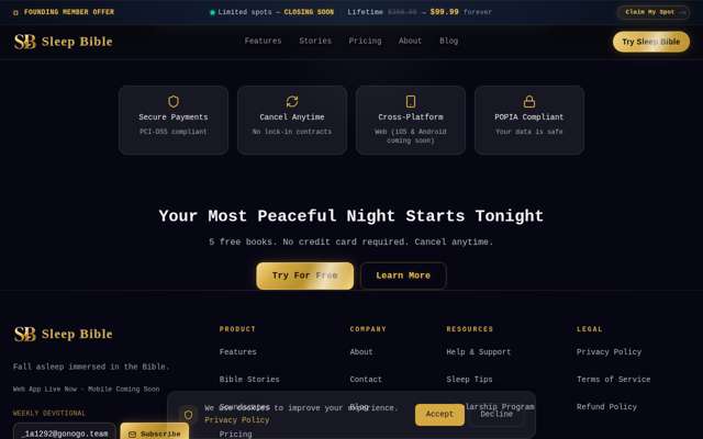
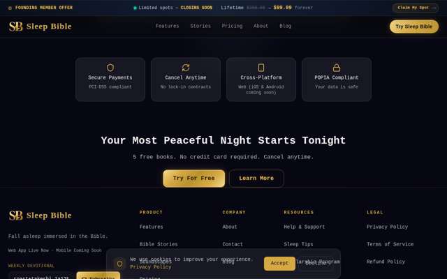
Sleek, calm, and immediately engaging; the dark mode aesthetic perfectly matches the 'sleep' value proposition.
Missing: Contact email address • Social media links • Trust badges or partner logos • Clearer font sizing for accessibility
Journey — 10 steps
“This looks promising. I really appreciate that they have an interactive demo right on the landing page—it addresses my biggest frustration with meditation apps that gate everything behind a sign-up wall. The 'cinematic' angle is interesting, and the UI feels modern. I want to see if the 'Features' page provides more technical depth on how it handles background audio and sleep timers, as those are critical for my usage.”
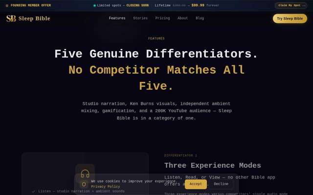
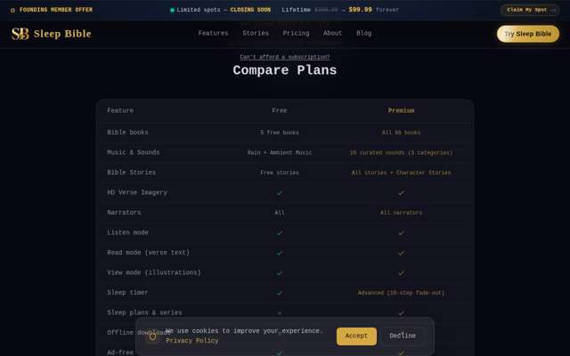
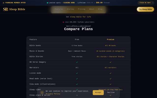
“The 'three experience modes' (Listen, Read, View) is a strong selling point, especially since I'm tired of apps that force audio-only or text-only. The comparison table is a bold move—I appreciate the transparency. I'm curious to see their pricing model now to see if it's reasonable or if they're locking everything behind a paywall.”
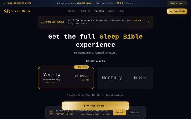
“The pricing is transparent, which I appreciate. The 'Founding Member' lifetime offer is tempting, but I'm still wary of the 'force sign-up' issue. However, the fact that they explicitly list what's included in the free tier and have a scholarship program makes me feel they aren't just trying to squeeze money out of users. I'm curious if the 'Free' tier actually lets me hear audio without a credit card.”
“The pricing is very transparent, which I appreciate. I like that they offer a scholarship program for those who can't afford it—that feels ethical and aligns with the 'prayer app' nature. The lifetime deal is tempting, but I want to see if the app actually delivers on the 'cinematic' promise before committing. I'm ready to try the free tier to see if the audio quality and UX meet my standards.”
“The pricing is very transparent, which I appreciate. I like that they offer a scholarship program for those who can't afford it—that feels ethical and aligns with the mission. The 'Founding Member' lifetime offer is tempting, but I'm still wary of the 'force sign-up' issue. I want to see if I can actually access any content without a credit card or account creation, but since this is a landing page, I'll proceed to sign up to see if the onboarding is as smooth as the marketing suggests.”
“The pricing is very transparent, which I appreciate. I like that they offer a scholarship program for those who can't afford it—that feels ethical and aligns with the mission. The 'Founding Member' lifetime deal is tempting, but I want to see if the 'Try For Free' flow actually lets me experience the content without a hard paywall immediately, as that's my biggest pain point with these apps.”
“The pricing is very transparent, which I appreciate. I like that they offer a scholarship program for those who can't afford it—that feels ethical and aligns with the mission. The 'Founding Member' lifetime deal is a bold move for a scale-up, and it makes me wonder about their long-term sustainability, but it's definitely an attractive offer for early adopters like me.”
“The pricing is very transparent, which I appreciate. I like that they offer a scholarship program for those who can't afford it—that feels ethical and aligns with the mission. The 'Founding Member' lifetime deal is a strong hook for early adopters like me, and the comparison table makes the value proposition of the Premium tier very clear. I'm ready to see how the actual signup flow handles the '7 nights free' trial.”
“The pricing is very transparent, which I appreciate. I like that they offer a scholarship program for those who can't afford it—that feels ethical and aligns with the mission. The 'Founding Member' lifetime offer is a strong hook for early adopters like me, though I'd want to know how often they ship updates before committing to a lifetime deal. The comparison table is helpful for making a data-driven decision.”
“The pricing is very transparent, which I appreciate. I like that they offer a scholarship program for those who can't afford it—that feels ethical and aligns with the mission. The 'Founding Member' lifetime deal is a compelling hook for early adopters like me, especially since I'm looking for long-term value. I have enough information to make a decision.”
Diagnosis
Users are experiencing friction due to aggressive, artificial sales tactics and poor information architecture regarding pricing. The landing page prioritizes high-pressure conversion tactics over clear, accessible information, which undermines trust and readability for potential subscribers.
What costs you conversions
What Works
Action Plan
Remove the countdown timer and 'Founders Offer' banner from the top of the landing page.
A top-level banner displaying a countdown timer and 'Founders Offer' text.
A clean header with no countdown timer or artificial urgency banners.
Multiple personas cited this as a primary friction point that feels like a high-pressure marketing shell.
Move the existing pricing information from the subpage to a dedicated 'Pricing' section on the landing page.
Pricing information hidden behind a click-through to a subpage.
A 'Pricing' section directly on the landing page showing subscription tiers and free vs. premium features.
Users are currently struggling to find pricing, which is a major barrier to conversion.
Update global CSS to increase base font size to 16px.
Body text font size is smaller than 16px, causing readability issues.
Body text font size set to 16px or higher for all paragraphs and UI elements.
Multiple personas noted the need for better readability to meet accessibility standards.
Standardize H1 tags across all pages.
Potential multiple H1 tags or inconsistent header structure.
Exactly one H1 tag per page, followed by H2/H3 tags for hierarchy.
Ensures proper page structure and improves technical clarity for users.
Add a footer containing a support email, social media links, and a 'Trusted By' section.
Absence of a comprehensive footer.
A footer section at the bottom of the landing page with support contact, social links, and trust indicators.
Increases brand legitimacy and provides necessary support channels for users.
Quick Wins
Growth Potential
Based on consumer_app benchmarks (Unbounce, Portent, Google)
potential revenue
$45,000/mo
Based on Abide ($15M ARR)
currently realized
64%
$28,800/mo
uplift
-8%
more conversions
Based on the performance of established faith-based meditation apps, a successful niche product can capture a segment of the market by converting 3-5% of a targeted user base into subscribers at a $60/year price point.