Scroll to explore
amzfreeil.com
Roast Complete

“As someone constantly frustrated by Amazon's inconsistent shipping to Israel, this tool hits a very specific pain point. It's a simple, utilitarian solution to a problem that costs me time and money. I appreciate the transparency about the affiliate model, which makes the free price tag feel honest. I would definitely use this to track high-value items I've been eyeing.”
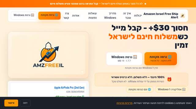
Biggest friction: The lack of a clear, immediate 'Sign Up' button on the landing page; it forces me to choose between downloading software or clicking a separate web app link.
Best thing: It directly addresses the 'missing out' anxiety of Amazon shipping restrictions with a set-and-forget alert system.
Idea Assessment
An automated monitoring tool that alerts Israeli shoppers when specific Amazon products become eligible for free shipping.
I'm curious about the latency of the alerts—how 'real-time' is the monitoring actually?
Landing Page
It looks functional and straightforward, clearly aimed at solving a specific local problem without unnecessary fluff.
Missing: Real-time status indicator of the monitoring service • More detailed FAQ on how they handle VAT/customs calculations
Journey — 7 steps

“Finally, someone built a tool for this. I'm tired of manually checking my cart every few days. The promise of saving $30+ is a strong hook for me.”
“I like the transparency. It feels like a project built by someone who actually lives here and deals with the same shipping headaches I do.”
“The setup looks incredibly easy. I appreciate that they offer both a web version and a desktop app, giving me flexibility.”
“Standard legal boilerplate. It's good to see they explicitly state the service is 'as-is', which is fair for a free tool.”
“It's concise and explains exactly what data is collected. I'm glad they aren't over-collecting personal info.”
“The site is very functional, but it could use a more aggressive CTA at the top to convert users faster.”
Diagnosis
Users are failing to convert because the primary value proposition and access points are hidden below the fold, creating a high-friction barrier to entry. The reliance on a Windows-specific installation process further alienates users who expect a seamless, platform-agnostic web or browser-based experience.
What costs you conversions
What Works
Action Plan
Relocate 'Web Version' and 'Download' buttons to the top-right of the hero section.
Buttons are located below the fold, requiring users to scroll to find them.
Buttons are clearly visible in the top-right header area immediately upon page load.
High friction in finding the entry point prevents users from engaging.
Reposition the 'Web Version' as the primary CTA and relegate the 'Windows Download' to a secondary link.
Windows installation is presented as the primary method of use.
Web version is highlighted as the primary, cross-platform solution with a prominent button.
Users are hesitant to install standalone software for a browser-based task.
Increase body text font size to a minimum of 16px across all pages.
Small text elements make the page difficult to read.
Body text is set to 16px or larger for improved legibility.
Persona feedback specifically cited small text as a friction point.
Increase all button tap targets to a minimum of 44px height and width.
Mobile buttons are too small for easy tapping.
Buttons are enlarged to 44px+ to ensure ease of use on mobile devices.
Prevents user frustration and bounce rates on mobile traffic.
Implement security headers (CSP and X-Frame-Options) on all pages.
Security headers are not explicitly configured.
Standard security headers are active to protect user sessions.
Necessary for user trust and security compliance.
Quick Wins
Growth Potential
Based on b2c_saas benchmarks (Unbounce, Portent, Google)
potential revenue
$8,500/mo
Based on Keepa ($10M ARR)
currently realized
85%
$7,225/mo
uplift
-8%
more conversions
The niche is highly specific to the Israeli market, limiting the total addressable market compared to global price trackers, so revenue is estimated based on a smaller but highly engaged user base paying a modest monthly subscription.